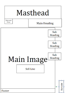
Colour Usage: For my front cover, I would like to use mostly dark colours, with a few bright colours that will stand out and attract attention. I would like my title to be red, with a yellow/gold outline, to make it really stand out. I may use this on all the text on the front page, but i am not sure yet. I would like to use a brick wall for background to make the magazine look more natural. It also goes with my urban theme.
Text Usage: With my text I want to tell the reader what the magazine is about, at a glance, so it needs to be big, bold and eye-catching. Perhaps an interview with a current top artist. This will give the magazine credibility straight away. I would like the sell line to be linked with the main image so i can have an explanation for the main image in plain sight. The main heading will point to the main article inside, (preferably the double page spread)
Image Usage: I only plan to use one image on my front cover, the main image. I hate magazines that have to many images on the cover. It looks tacky, overworked and most of all it just doesn't look right. That is why I would like one massive image, that represents what the magazine is about. I have a few ideas for what the image might look like, but i would like to take a few different shots, and choose from there.

When you say "The Streets" do you mean urban as opposed to the band??
ReplyDelete